The Problem
A start-up environment requires moving fast in a short time, this left an impact on how the platform evolved and after a year of rapid growth, the platform ended up with busy user flows. The future designs were standing in front of complex implementation challenges.
The Solution
Defining the IA to get the big picture regarding the volume and complexity of the platform and building the navigation choices based on the IA.
Navigation Pattern
Otonomo collects the widest and most diverse range of data from connected vehicles and makes them available through the SaaS Platform.
The Fleet Platform

My Role
-
Research
-
Sketches
-
UX
-
UI
The Team
-
Design Team
-
Product Team
-
R&D Team
Tools
-
Figma
-
FigJam
-
Optimal Workshop
Years
2022
Card Sorting
What is card sorting and how users' input might assist us to build the best pattern navigation?
Card sorting is a method used to help design or evaluate the information architecture of a site.
In the card sorting session, I asked users to organize topics into categories that make sense to them and may also help with labeling these categories.
To conduct the card sorting session I used the Optimal Workshop tool.
Benefits of Card Sorting
Card sorting helped the product team to understand our users' expectations and deeply understand the platform content.
Knowing how our users group the information helped us to:
Build the structure for the platform
Decide what to put on the main menu
Label categories and build the right navigation to support main flows
How?
First I created an inventory of all topics in the platform and double-checked it with the PMs.
I asked them to come up with all future features they might consider implementing in the platform and added them to the inventory.
This inventory was the topics (cards) that needed to be sorted in the card sorting session.

Qualitative and quantitative research:
After the users organized the topics into groups and named the groups, 16 practitioners, I got the results as a dendrogram.
The dendrogram results from now were the platform compass in relation to navigation pattern decisions as it relays on real users' expectations, so assumptions can be left aside and all stakeholders can discuss the best pattern based on quantitative results.
Dendrogram results

Navigation Pattern before card sorting

Based on the IA research I improved the navigation pattern to support the user's main flows.

Improve the way users generate reports
One of the main flows in the platform is report generating, this is how the users are able to consume data on their vehicles.
The IA research thought us a lot about how users preserve reports on the platform. They expect to "Get Data" within the Report page.
Decisions on removing the "Get Data" button from other pages and adding it to the Report page were taken after analyzing the card sorting results.
Before


After


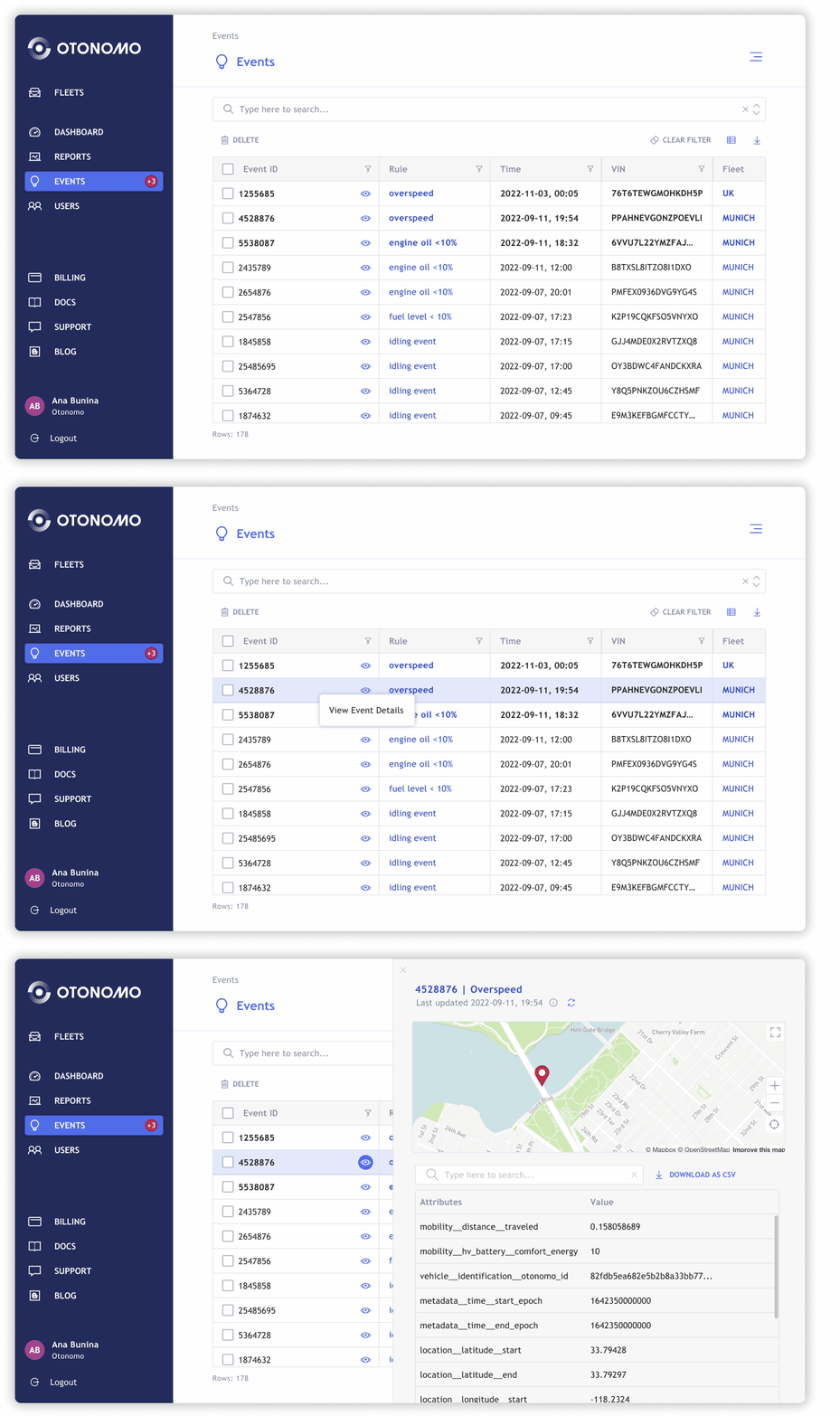
Rules and Events new entity in the platform
Here insert the 5 options for rules and events

Before having the IA understanding, decisions on navigation patterns and information hierarchy were hard to be taken.
For Example: When we had a review session on Rules and Events (future features in the platform) we ended up with too many options for implementation as we had a structure limitation.
We have added the capability to create Rules on vehicle behavior in the fleet and track the Events that were triggered as a result.
We have learned from the dendrogram that users tend to preserve both Rules and Events as a whole. I assumed that it will be likely that they will look for the Rules under the Events or vice versa - depends on which entity from the two we will decide to expose in the left navigation menu.
No matter which will be in the menu, users will expect to find the other entity in the same cluster. The dendrogram shows it significantly.


To avoid extra development load and keep consistency I relied on existing components and patterns, for example: for the Event drill down I kept the right drawer navigation pattern as it is already in use with another entity in the platform.
